Crypto withdrawals, simplified and secure
Smooth Crypto Withdrawals Redesign

The client, a leading cryptocurrency platform, faced significant issues with their withdrawal process. Users were experiencing poor UX, leading to long transaction times and incorrect fund transfers, resulting in financial losses and diminished trust in the company.
Timeline
From the moment I identified the problem to the completion of the redesigned functionality, it took me 3 months, balancing this project alongside others.
Background
The client’s withdrawal system was causing frustration among users due to its complexity and inefficiency. My goal was to simplify and streamline the process, ensuring a seamless experience that restored user confidence and reduced errors.
This category details the step-by-step approach taken during the project, including research, planning, design, development, testing, and optimization phases.
Research & Planning
I quickly identified the core issue: users didn’t understand the withdrawal process, which took an average of 8 minutes. I stripped down the process to its essentials, focusing only on the critical questions needed for a successful withdrawal. With these insights, we began planning a user-friendly solution.
Design & Prototyping
Using the brand’s UI kit as a foundation, I designed additional elements and states, particularly for inputs and alerts. Our high-fidelity prototype included various scenarios to guide the user through the process seamlessly.
Testing & Optimization
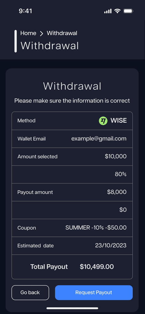
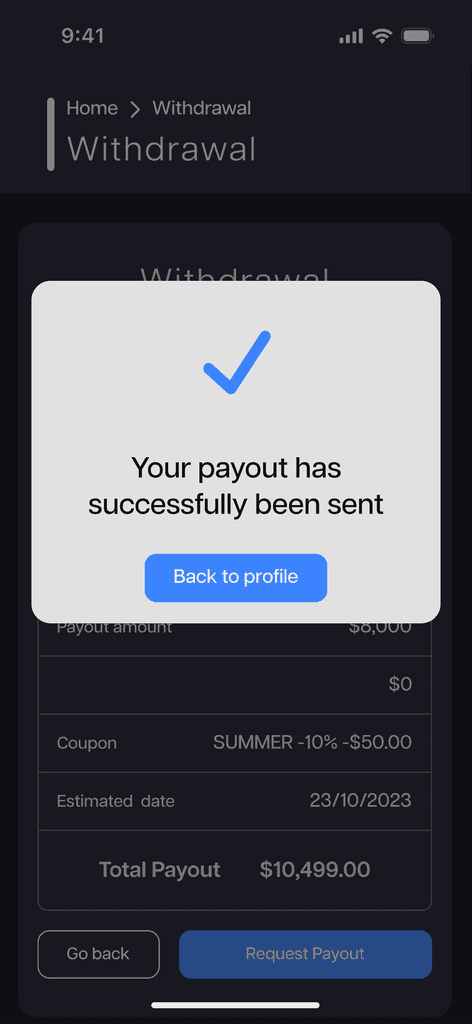
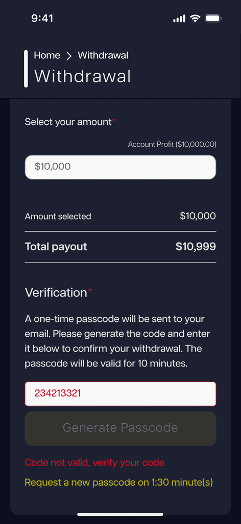
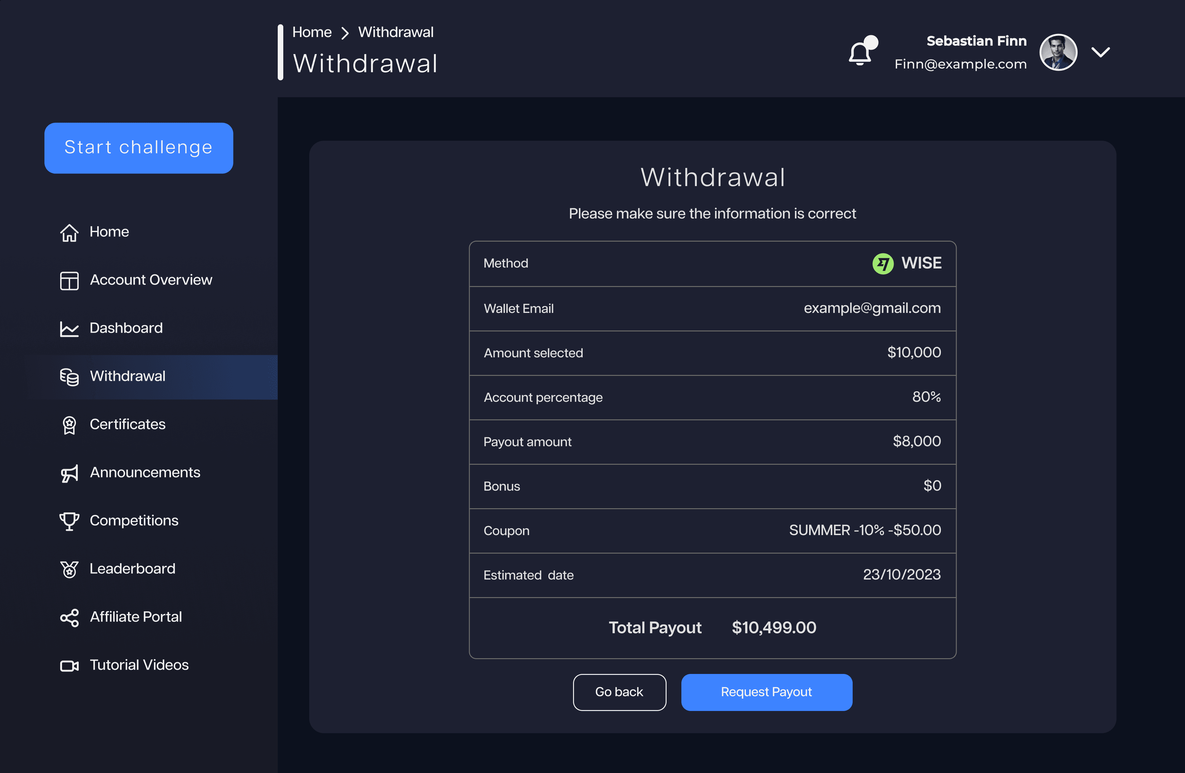
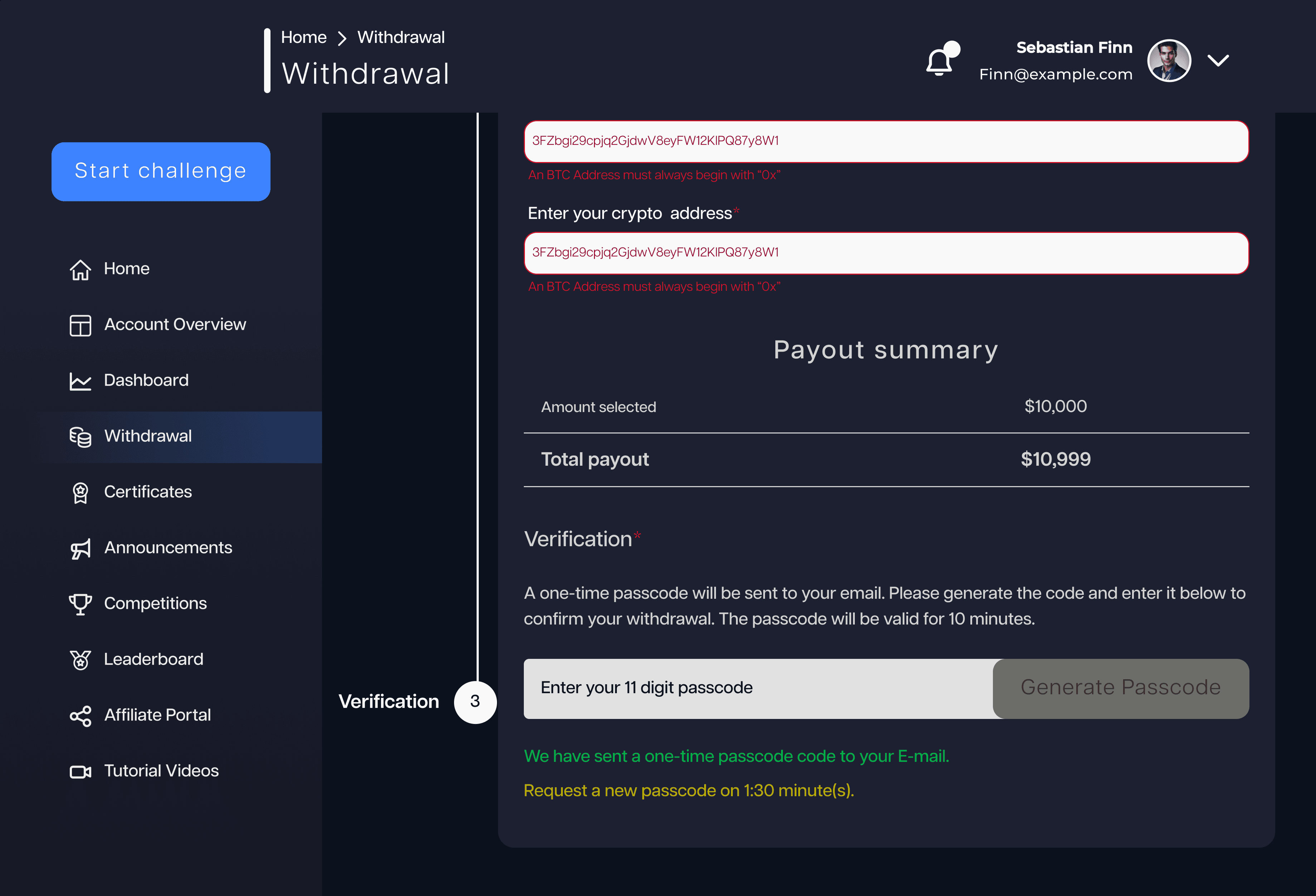
The company allowed me to test with actual users, leading to around two iterations. A significant improvement was adding a summary at the end, reassuring users of the correctness of their input and the withdrawal amount. I also added an email verification step, which greatly increased user confidence. This testing phase took about a month and was crucial in fine-tuning the final design.
Heatmaps were crucial in identifying a lack of clear calls to action and transparency in sharing user data within this area. This hindered the creation of competitiveness and a sense of inclusion in upcoming challenges. To address this, I implemented the following solutions:
Streamlined Form
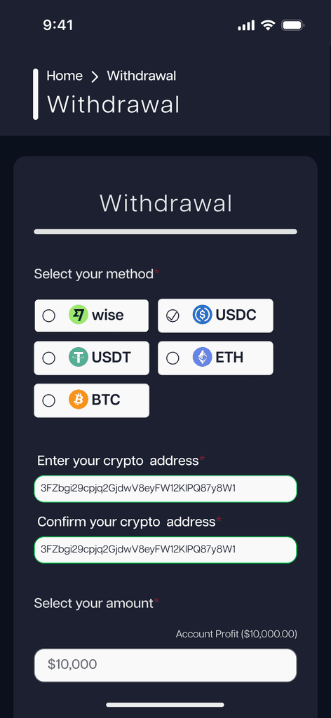
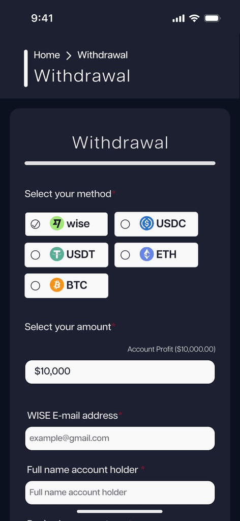
I removed unnecessary questions and organized information hierarchically in a detailed, user-friendly form.
Clear Placeholders
I ensured each placeholder had clear and precise instructions for the user.
Specific Error Messages
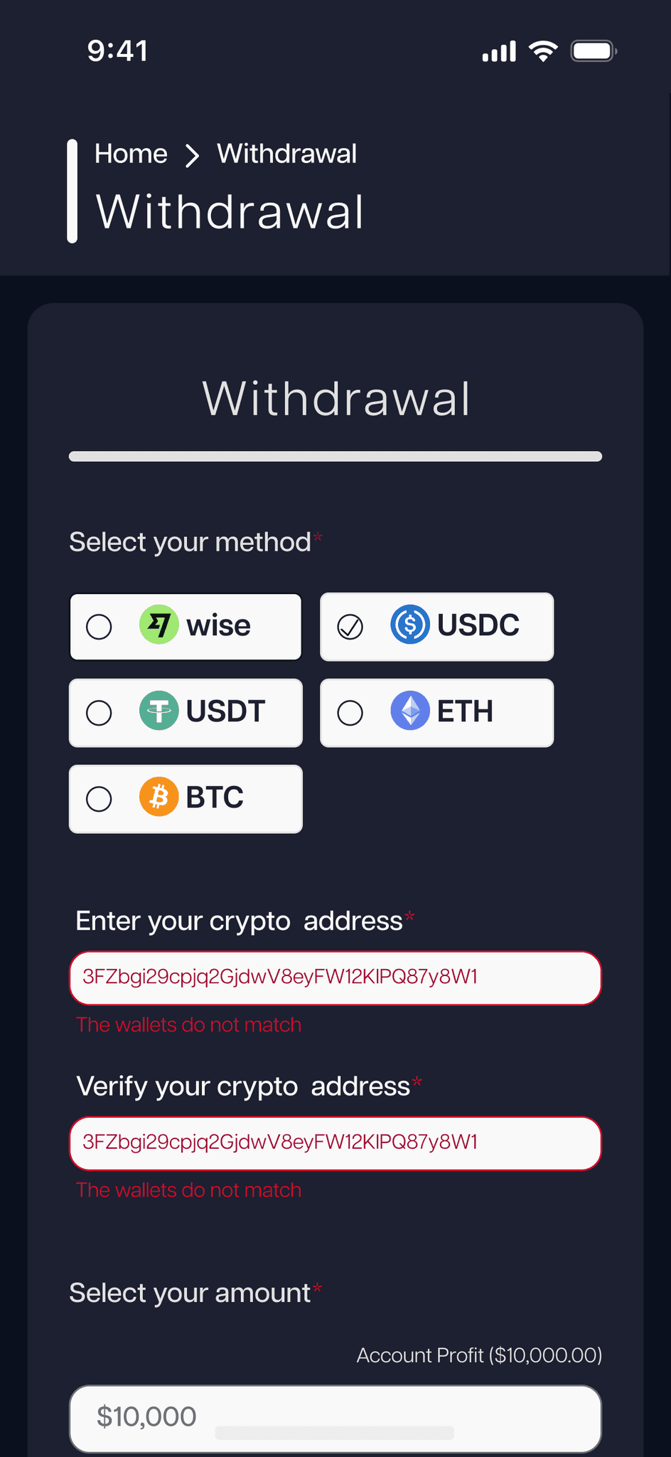
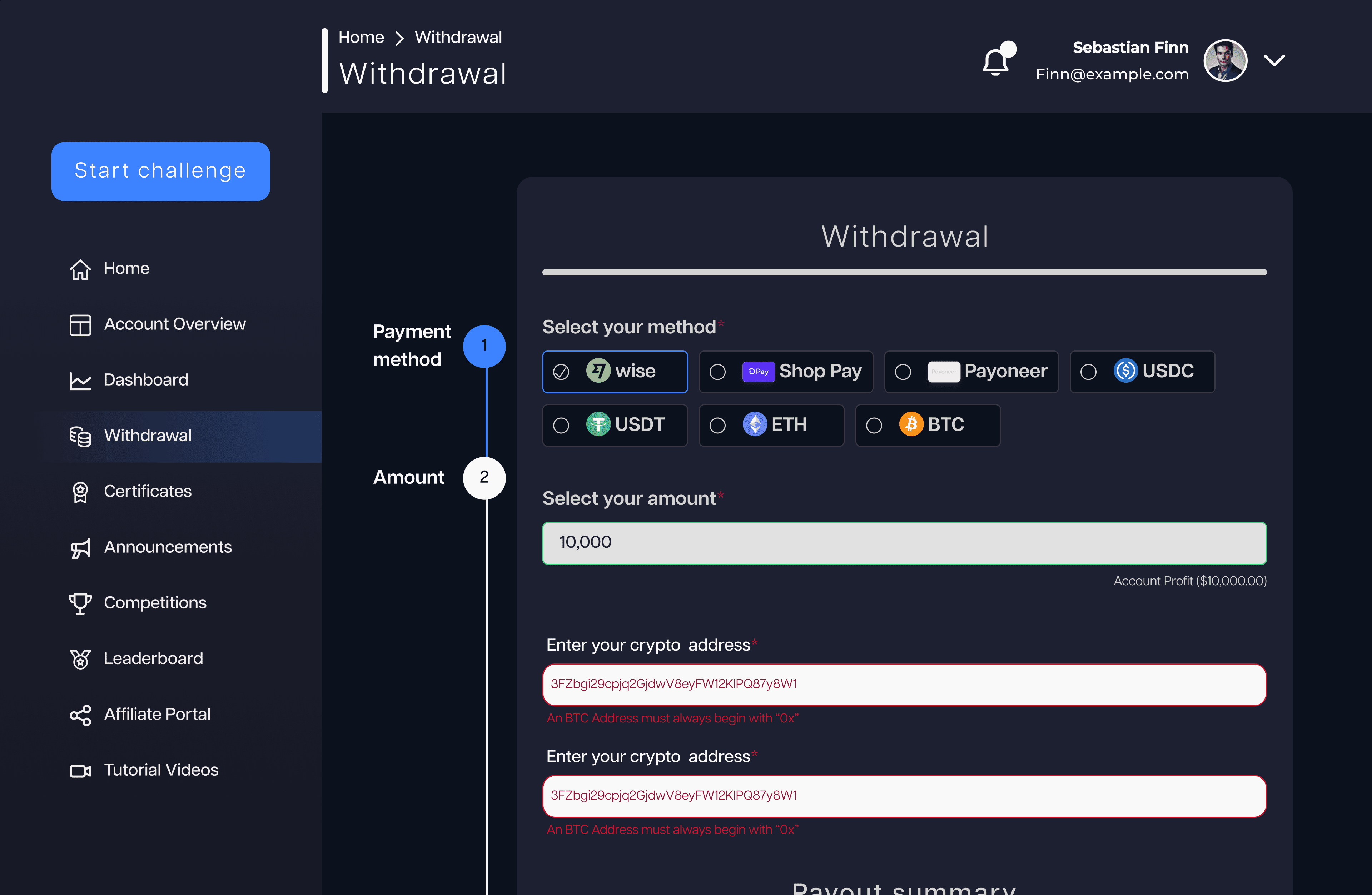
Instead of generic error messages, we provided specific feedback in red to easily catch the user’s attention.
Custom Screens for Different Payment Methods
Each payment method had a tailored screen, removing irrelevant inputs and simplifying the process.
Verification Step
A code sent to the user’s email for final confirmation, increasing security and trust.
Here, the outcomes and achievements of the project are highlighted, including user feedback, adoption rates, and industry recognition.
Reduced Time
Average completion time dropped from 8 minutes to 1.3 minutes, making the process swift and hassle-free.
Minimized Errors
The new design significantly reduced the error margin, leading to fewer support tickets and calls.
Enhanced Interface
The interface became more attractive, modern, and simplified, providing a better overall user experience with constant guidance and a responsive design.
